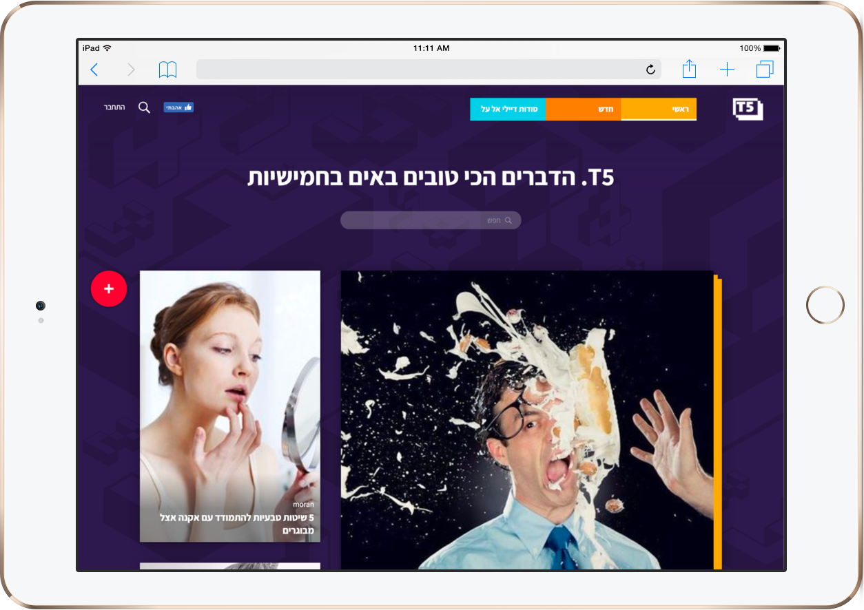
Graphic language creation, branding and development of the T5 website, a digital platform from the Keshet group that in one year became one of the most successful sites in Israel.
When we met with the people of Mako-Keshet for the first time, and they presented an initial brief to us, we immediately began imagining the product we wanted to get to. A few months later we met again, and this time we presented the branding and graphic language that we created. This is how the T5 brand was born and became one of the most successful websites in Israel within a year.
So, what did we do in this project? Website integration, concept positioning, branding and creating a graphic language, UI UX design, icon sketching for the site, product development – client development and smart management interface development, and, of course, like any of our products, a silent launch with rigorous testing before officially launching into the air.
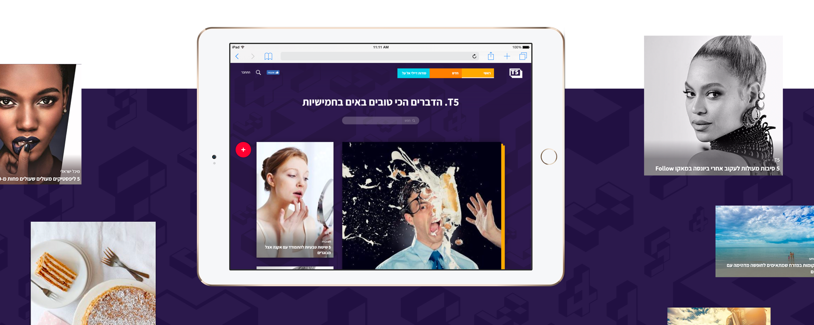
Within less than a year, T5 became one of the most successful sites in Israel With huge traffic and data numbers: 7012 lists created by users and site editors, 145 K friends on the Facebook page, 28 million viewed pages and hundreds of leads and inquiries from customers who approached us after seeing T5.
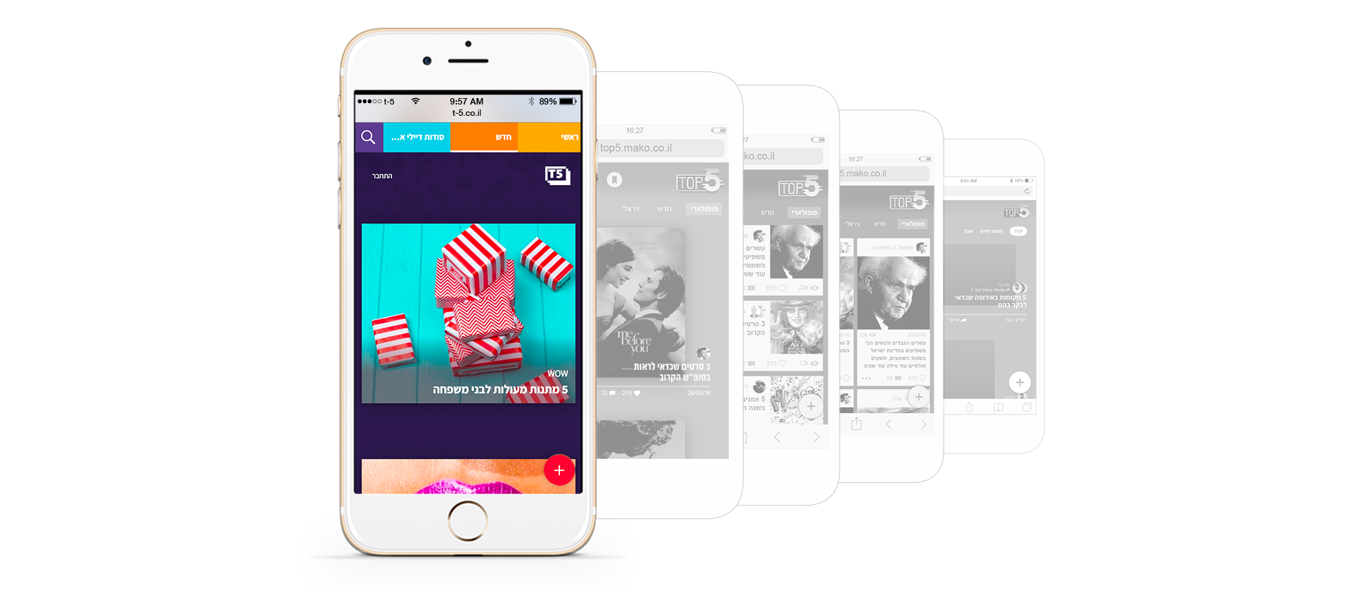
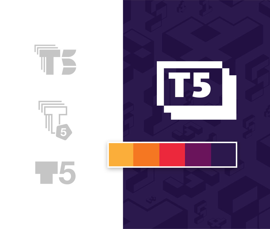
We arrived at the branding process after many meetings in which we decided on the values we want to attach to the brand. From the very first meetings, we understood that we must create a level of playfulness with the logo, and the colors and way to the final product was long. It included research processes and various directions that we created, and surveys we performed that led us to the insights we used before deciding on the final branding.
The brand we created was full of challenges, already from the user experience planning stages, we encountered one: how to find the correct way to maintain the values we created during the branding stage and successfully convey them via the user experience. During the project, we created and launched four versions of interfaces with different user experiences, and only after launching, we chose the best option according to the data and tests we performed randomly on users.
Product development was the most enjoyable part of the project stages: seeing the design come “alive” though the joint work of the development team and the user experience designers that worked closely with the developers throughout the process.
28 million viewed pages in a year
First of all, client and user experience
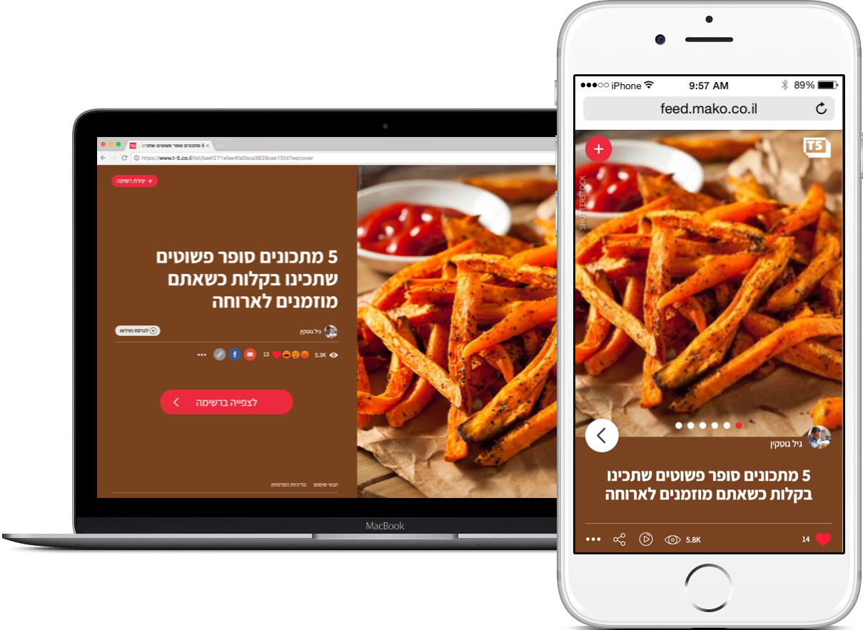
We knew right from the start that we needed to bring something inspired to the user experience and we succeeded, in the small things too. The special “search” field creates something very innovative and interesting, and on the other hand, it is very easy for the user to search the site. The transitions in the list are combined with smart animations and the user can move from list to list using a computer keyboard or by swiping their mobile screen. The animations are in the right places, which makes the experience user-friendly while also being very playful, just like the values that we’re aiming for.
T5 Desktop version
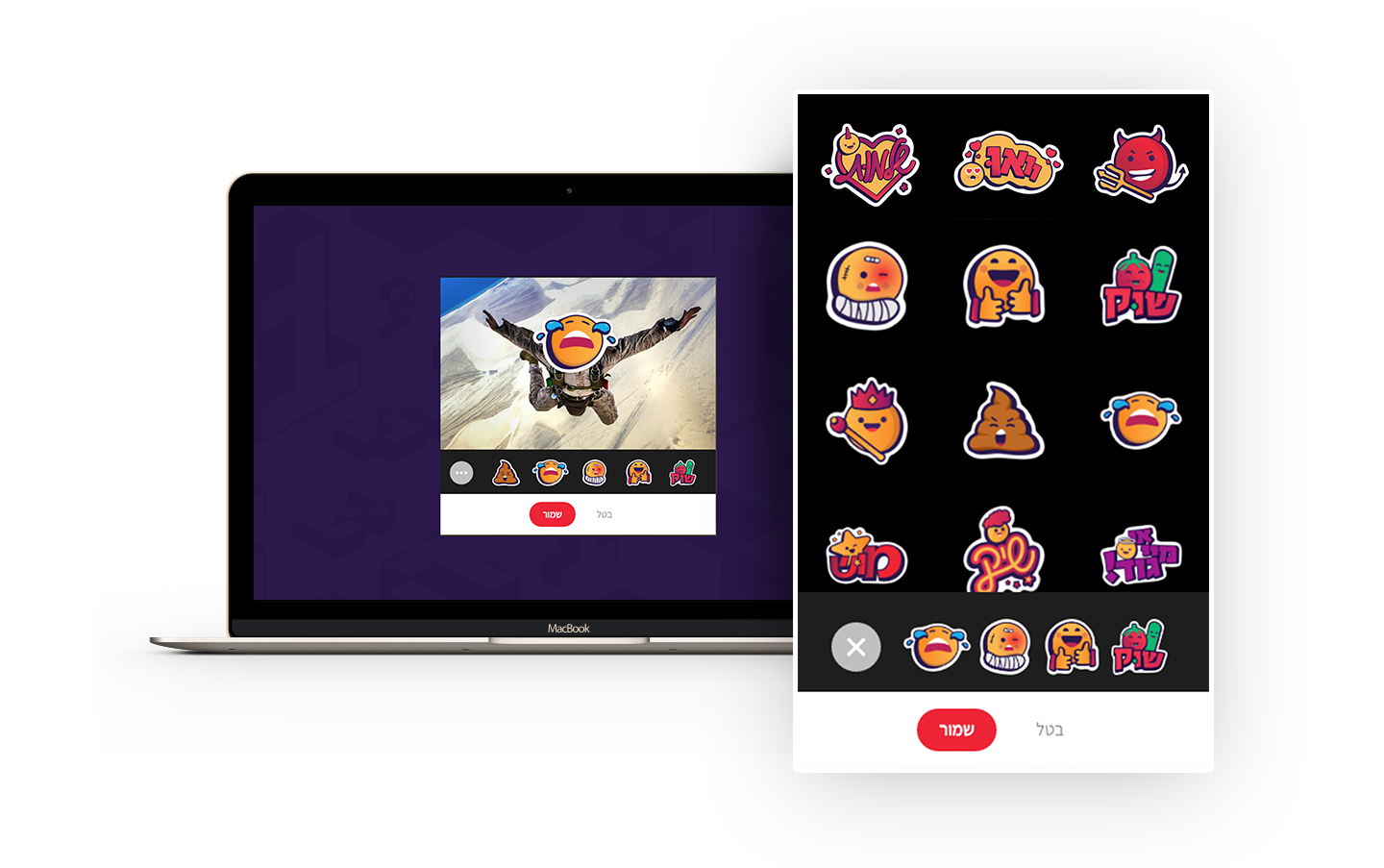
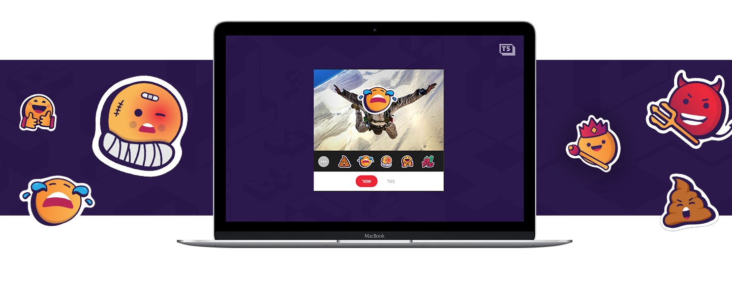
A smart system for creating videos automatically through the management interface
In the initial briefing stages, the people at mako realized that in order to draw visitors to the site, they needed a good product, good content, and video teasers – the strategy was clear: Post teasers to social networks and direct the visitors to view complete list on the site. In order to create this concept without tasking an entire video department with creating the videos, we developed a smart system that can make videos of different formats with content from any list. This makes work easier for the website’s editors who with a single click can create a video from the content they entered on the site. The various videos were shared and became very viral on social networks, and in this way, T5 became one of the most successful sites in Israel within a year.
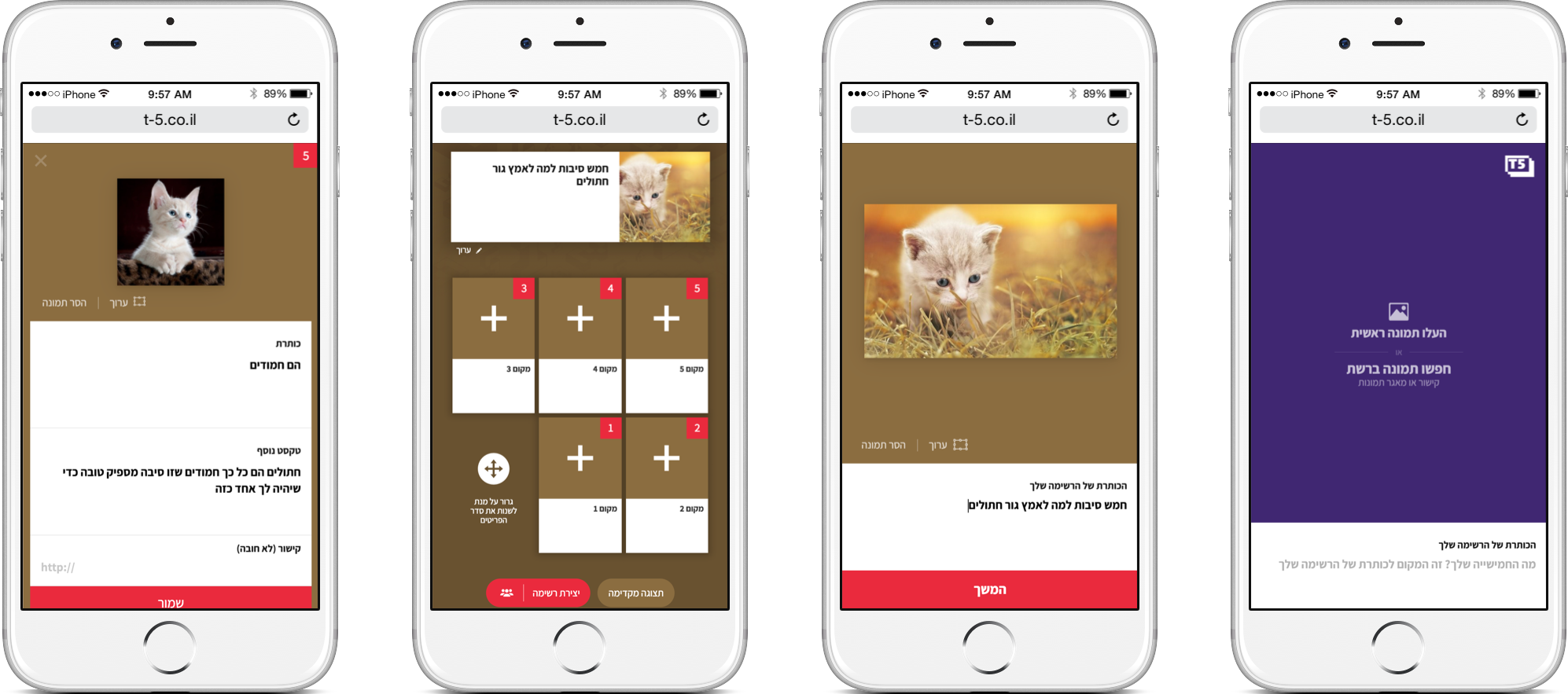
We arrived at the management interface at the beginning of the process, after discovering over the years that content sites do not have a deep enough understanding of the importance of management interfaces. This is ultimately detrimental to the final product. Luckily, the team at mako was the one who pressed us to invest in a successful management interface because they knew clearly that an interface that is easier to work with leads to higher-quality content and offers the editors greater choice.
We develop custom-made management interfaces from scratch without using any templates or ready-made systems. Only in this way can we fit management to the unique needs of the editors.
The management interface allows editors to make lists very simply, to cut images and create different versions of pictures for different platforms.
Dealing with traffic with minimal resources
Our vast experience in developing digital products that support hundreds of thousands of users simultaneously helped us on this project too – T5 is able to handle many visitors while using minimal resources and server costs.
For every product we build, we produce the architecture of the environment and the servers in the early stages of development with an emphasis on two matters: One, on the digital product that must load quickly for users with internet networks of lower quality, and two, cost savings and resources.
T5 Branding
Technology
Client- react js
Admin - node js
Wrapped in Docker on AWS environment
