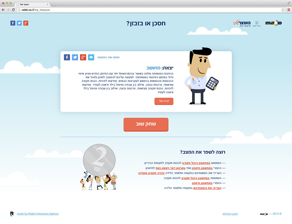
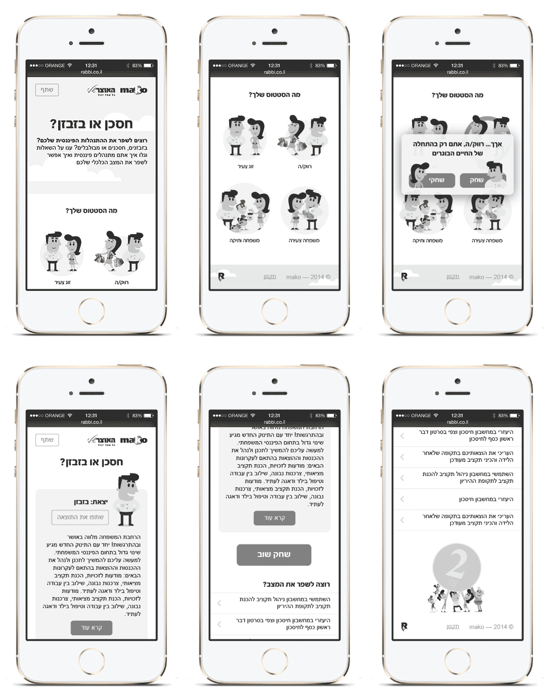
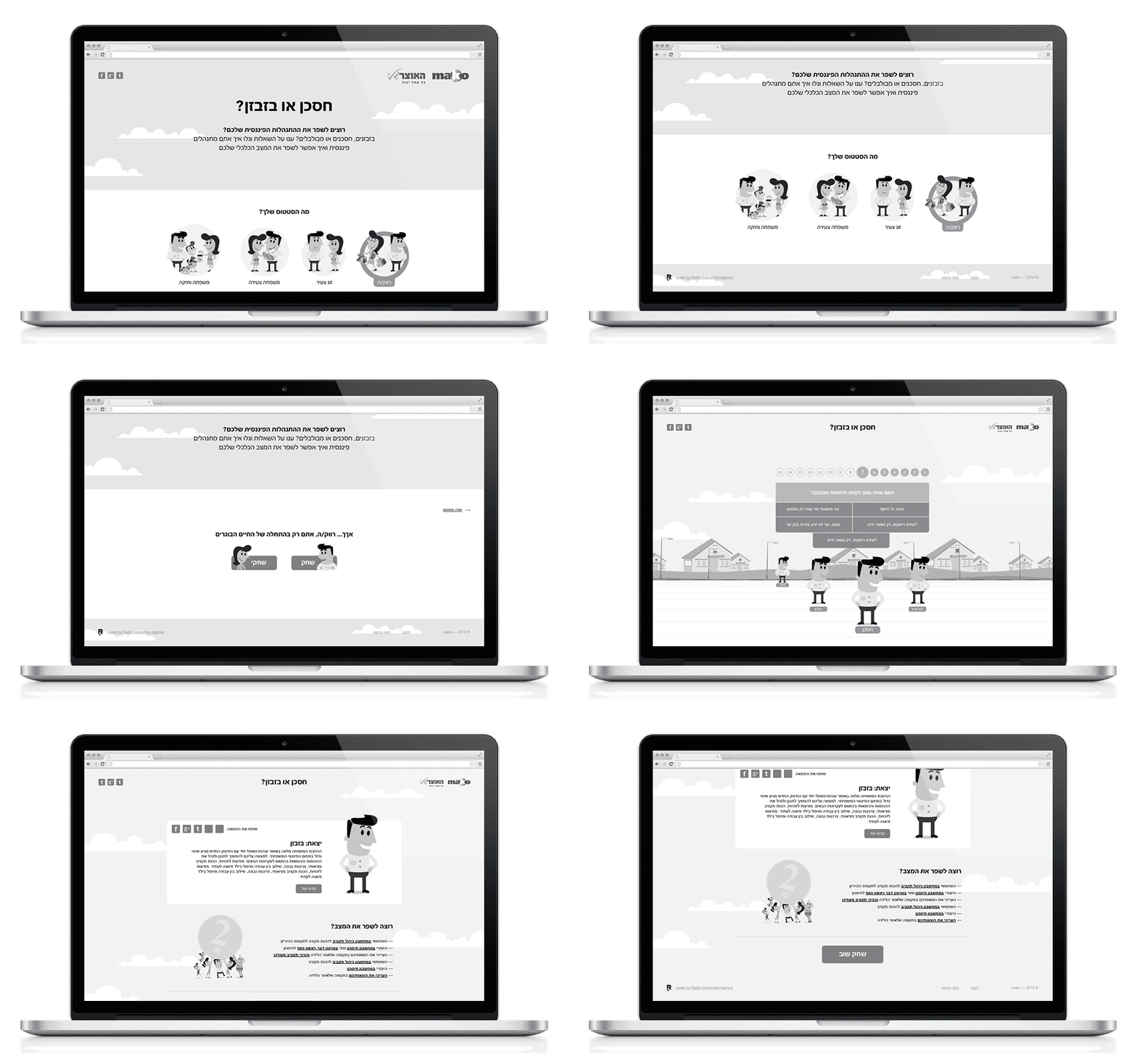
We designed the content activity for the My Treasury campaign on the Mako site, as part of an operation to increase public awareness of the economic decisions we all must make. The specialized activity site we built allowed visitors to check their situation and the way in which they manage their money. The visual mechanism we designed presented various questions that finally presented the visitor’s status regarding their money management, together with information and tools that could help them make better decisions, according to the answers provided during the activity.
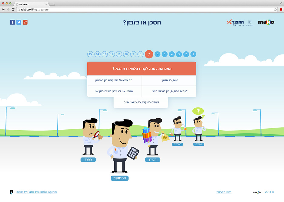
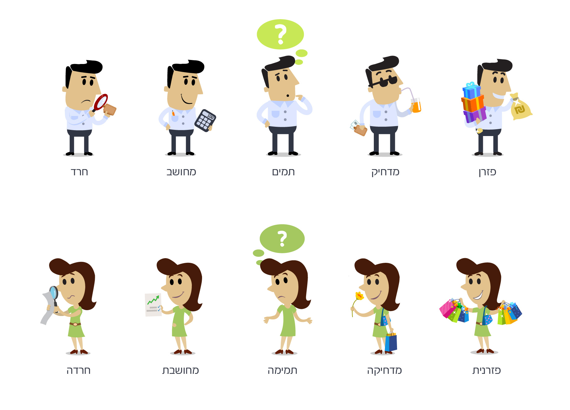
The activity interface was designed carefully for all platforms together, with integration of visual elements and various characters according to the status and results of the visitor. We drew the main character of My Treasury, which we received from the client, with new facial expressions. We drew various elements that add to the character and represent its character: spendthrift, repressed, naïve, deliberate, anxious, etc., while during the activity itself and according to the visitor’s answers, the relevant character would advance with its characteristics.
